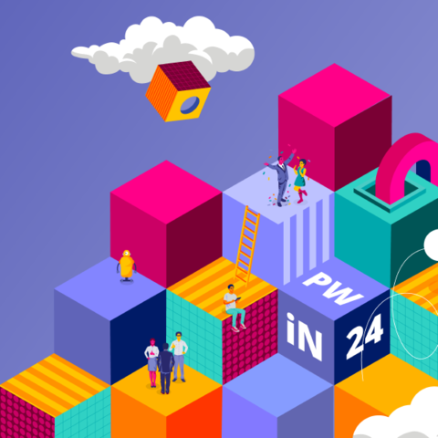
Theme UI-Kit - Customizing an application with App Studio

From PegaWiki
Revision as of 12:43, 21 December 2022 by Choca (talk | contribs) (added the content retired template)

(diff) ← Older revision | Approved revision (diff) | Latest revision (diff) | Newer revision → (diff)
Jump to navigation Jump to search

Theme UI-Kit - Customizing an application with App Studio

Description How to customize an application using low code tools App Studio
Version as of 8.5
Application Pega Platform
Capability/Industry Area User Experience


This content is being retired in the next few months. Please use our documentation site https://docs.pega.com to find information you may need.


App Studio provides an ability to customize your application's look and feel to align with your organization's branding and design guidelines. By using themes, you can change the way the application looks. Themes provide uniqueness and consistency across all your applications.

Selecting an application theme

Selecting application theme settings

App Studio provides a user-friendly interface to apply a theme to the application. Pega-provided themes support different attributes to change an application UI such as banners, backgrounds, borders, buttons, colors, and shapes.

You can change the colors of your application by selecting different color palette options that are provided in Pega Platform, or you can add your own colors based on the organization's branding. These theme colors will apply to all backgrounds, buttons, borders, and so on. You can also customize the font size, color, and style.

Pega Platform provides various ways to customize a theme for your application.

Theme section

The Theme tab is available in the application settings of App Studio. The tab provides all basic theme attributes like colors, fonts, borders, and so on. You can also add simple CSS styles that you cannot select on the Theme tab.

For more information, see Updating the Cosmos theme in your application.

Theme tab section

Skin

Pega Platform provides a default skin with each application, with a user-friendly interface to customize application interfaces, controls, layouts, and so on.  

The skin is mainly divided into the following major areas of customization:

Mixins

Mixins are reusable style patterns that can be applied to UI components. Mixins provide all basic theming attributes such as color, font, border, size, and so on. You can create and override mixins. With mixins, you can create incremental styling changes through reuse and inheritance.

For more information, see Mixins.

Formats

Formats are reusable styles that define the visual presentation of UI components,

Pega Platform provides predefined formats to use in your application. Use out-of-the-box formats as often as possible.

You can create new formats or override existing formats, and apply them to controls, layouts, and sections. Do not override default skin formats or create new custom formats, as this action might cause your updates to fail, deviate from the Cosmos design system, and result in inconsistent experience across your applications.

For more information, see Component style formats.

Style and skin inheritance

Do not use custom CSS. You can attach existing CSS to an application skin to include existing branding styles. You can also define custom CSS classes and reference them in controls, dynamic layouts, sections, and so on.

Skin inheritance helps you reuse design patterns between skins. By setting up inheritance relations between skins, you can adopt a tiered approach to styling that reduces development effort in similar applications.

For more information, see Skins.

CSS Helper classes

Helper classes are readily available CSS code snippets, which can be added to sections and controls to customize your UI Interface. Pega Platform provides a wide variety of helper classes that are useful for styling layouts, spacing, fonts, colors, and many more.

Use this approach for styling an application.

For more information, see CSS Helper classes.